What the report actually counted
These totals were published by the original project, not independently audited. Participants and votes are different quantities. A participant could contribute on multiple days; the vote count must not be described as the number of unique people.
Dividing the reported totals gives approximately 4.16 votes per reported participant over the whole period. That is an arithmetic ratio, not a retention measure. It says nothing about the distribution of return visits, and it cannot establish that a typical person returned four times.
The event windows in the original report
| Period / event | Reported result | What it refers to |
|---|---|---|
| First four days | About +2.5 | Index level; algorithm adjustment affected the rise |
| 12–16 May, China earthquake | More than 24,000 votes; mean about −1.943 | Window’s votes and average rating; reported index low was −0.958 |
| 3 June, Obama nomination milestone | More than 64,000 votes; mean about +2.59 | Reported event figures; index increased by 0.689 |
| US floods, June | Decline exceeding 1.64 over eight days, to −0.332 | Index movement and resulting level |
| Georgia war, August | Decline of 0.545 over seven days | Index movement, not an absolute score |
Notice how much information is lost if all these numbers are called “the rating.” A mean of individual responses, an index level and a change in an index answer different questions. They cannot be placed in a single line chart as interchangeable observations.
A positive episode matters too
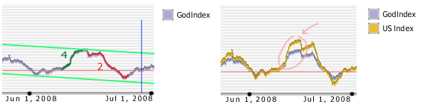
The report did not describe only negative events. It also connected political hope with an upward movement. For a new research programme, that contrast suggests a useful design: decide in advance how both favourable and unfavourable events will be included. Selecting only dramatic declines after seeing the graph would make a one-sided account almost inevitable.
An event-study protocol would need a defined announcement time, baseline period, observation window and exclusion rules for overlapping news. The archived report did not supply enough underlying data for us to rerun that design.
Country views and the global total
The report discussed views for France, Germany, Poland, Russia, the United Kingdom and the United States. It described the US Index’s share of the overall index as exceeding 42%. That is the report’s statement about index composition; it is not a verified count of US participants or a population weight.
No country-by-country table of unique participant totals has been recovered for this report. We therefore do not turn the six country views into a map of voter counts. The country analysis explains what can still be learned from the comparisons.
What this report can — and cannot — demonstrate
It establishes that the project published a substantial set of participation claims and interpreted its graph against real-world events. It offers hypotheses about emotion, attribution and attention. It does not demonstrate that the events caused a measured change in the opinions of a representative population.
The original prose sometimes presents causal explanations with more certainty than the surviving evidence permits. Our editorial approach is to preserve the numerical claims and charts, attribute those explanations to their authors, and avoid repeating them as settled science.
For the later record, continue to the 2008–2010 history. For analysis design, see the research brief and methodology notes.
Sources & verification
Editorial review: 6 September 2026. Found an error or another archive? Please contact us.